Karen's Map Catalog
Tuesday, November 22, 2011
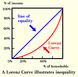
Lorenz Curve
A Lorenz Curve, sometimes known as an accumulative line graph, is a graph that generally is used to express inequality. Often the subject of these graphs is wealth distribution in a population. A line of equality is drawn to emphasize how severe the differential may be as you can see above.
http://ingrimayne.com/econ/AllocatingRationing/Figure6.5.gif
Population Profile
http://www.ninis.nisra.gov.uk/mapxtreme/GFX/NI_Animated_Profile3.jpg
Cartographic Animation
Cartographic animations are a great way to show changes and shifts in the Earth's atmosphere or surface over a period of time. By using both cartography and graphic art people are able to present these changes as the animation above shows the shifts of the wind velocity magnitudes on a global scale. Again a shading scale is used to capture these shifts.
Correlation Matrix
A correlation matrix, as the name suggests, is a matrix dedicated to presenting correlations in a pair of data sets based on gathered statistical values.
http://psycnet.apa.org/journals/cbs/25/4/images/cbs_25_4_590_tbl2a.gif
Similarity Matrix
Similarity plots compare a variety of variables to find patterns within the data collected. The plots generally are used to find similarities present in the data. The image above is such a plot showing relative commonalities between those listed along the graph.
Climograph
Climographs are a unique way to show the weather of a certain region, including temperature and precipitation, in a graph format. They incorporate two types of graphs into one using a line graph to represent the temperature and a bar graph to represent the amount of precipitation as is shown in this climograph of Memphis, Tennessee.
http://southhill.vsb.bc.ca/Departments/Humanities/Geogpraphy/Kyle/Notes/2_Atmosphere/Interactive_climate_map/climographs/memphis.jpg
Windrose Diagram
A windrose diagram graphs the direction and speed of the wind in a certain location. As is shown in this windrose, color is often used to indicate specific ranges of wind speed.
http://www.mathworks.com/matlabcentral/fx_files/17748/5/wind_rose.png
Subscribe to:
Posts (Atom)


