Tuesday, November 22, 2011

Lorenz Curve


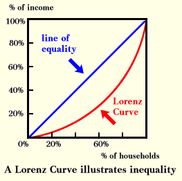
A Lorenz Curve, sometimes known as an accumulative line graph, is a graph that generally is used to express inequality. Often the subject of these graphs is wealth distribution in a population. A line of equality is drawn to emphasize how severe the differential may be as you can see above.

http://ingrimayne.com/econ/AllocatingRationing/Figure6.5.gif

Population Profile


The image above is a population profile depicting the number of males in Northern Ireland in 1971. The graph spans from zero to ninety years old and in viewing the data in a graph format we are able to see the difference in the population as well as find an age where each gender has roughly the same number of individuals.

http://www.ninis.nisra.gov.uk/mapxtreme/GFX/NI_Animated_Profile3.jpg

Cartographic Animation


Cartographic animations are a great way to show changes and shifts in the Earth's atmosphere or surface over a period of time. By using both cartography and graphic art people are able to present these changes as the animation above shows the shifts of the wind velocity magnitudes on a global scale. Again a shading scale is used to capture these shifts.


Correlation Matrix


A correlation matrix, as the name suggests, is a matrix dedicated to presenting correlations in a pair of data sets based on gathered statistical values.

http://psycnet.apa.org/journals/cbs/25/4/images/cbs_25_4_590_tbl2a.gif

Similarity Matrix


Similarity plots compare a variety of variables to find patterns within the data collected. The plots generally are used to find similarities present in the data. The image above is such a plot showing relative commonalities between those listed along the graph.


Climograph


Climographs are a unique way to show the weather of a certain region, including temperature and precipitation, in a graph format. They incorporate two types of graphs into one using a line graph to represent the temperature and a bar graph to represent the amount of precipitation as is shown in this climograph of Memphis, Tennessee.

http://southhill.vsb.bc.ca/Departments/Humanities/Geogpraphy/Kyle/Notes/2_Atmosphere/Interactive_climate_map/climographs/memphis.jpg

Windrose Diagram


A windrose diagram graphs the direction and speed of the wind in a certain location.  As is shown in this windrose, color is often used to indicate specific ranges of wind speed.

http://www.mathworks.com/matlabcentral/fx_files/17748/5/wind_rose.png

Triangular Plot


Triangular plots are used to graph data pertaining to three variable and finds an average between them. This information is percentage based and as you can see in the image above soil composition is being analyzed for sand, silt, and clay.

Index value Plot


Index value plots help to show discrepancies in data and how far off values are from a fixed point. This plot in particular shows the average annual steamflow since 1999 in North Carolina.

http://3.bp.blogspot.com/-vhksSXhmxPM/TbOfdfg1_aI/AAAAAAAAACs/HcYtpbWVuVs/s1600/Map+17.gif

Box Plot


Box plots are used by many to show variation and the location of information in a set of data and are great tools when comparing various things like energy output like the plot above. It graphs the energy output of  four machines showing that machine three is significantly ahead of the others. These bowes show the range each machine reaches since not every trial will come out with the same results.

http://itl.nist.gov/div898/handbook/eda/gif/boxplot0.gif

Scatter Plot


Scatter plots compile information representing two variables and provide an easy way to determine a relationship between them. One variable is listed along the x axis and the other along the y axis and if a trend is found in the plots a line is often used to emphasize the finding.  This is a scatter plot graphing the correlation between arm strength and grip strength.

http://davidmlane.com/hyperstat/pictures/strength.gif

Stem and Leaf Plot


Stem and leaf plots are an easy way to analyze numerical data. On the left the stem represents the first digit of a number and on the right the leaves are the second. These plots are ideal when analyzing ages or trying to find the mean of data.  This plot shows the infant mortality rate of West Africa.

http://mainland.cctt.org/mathsummer/josephbond/stemandplots/images/table2.gif

Bathymetric Map


Bathymetric maps are like topographic maps, but they recreate the ocean floor below sea level, not just the terrain above. This image reflects the ridges and sea shelves found under the ocean and depicts where the deepest spots can be found across the globe.


http://maps.grida.no/library/files/world-ocean-bathymetric-map_003.jpg

Parallel Coordinate Graph


Parallel Coordinate Graphs are ideal in analyzing the relationship between variables. As the variables are graphed on a vertical axis sometimes it takes on a three dimensional quality.  The graph above uses various colors to differentiate between variables in the data involving a study of genes.

http://vis.lbl.gov/Vignettes/Drosophila/3DParallelCoordinates.png

Light Detection And Ranging (LIDAR)


Light Detection And Ranging is an optical remote sensing technology that measures properties of scattered light to directed at a specific target to generate range and other information desired. The time delay between the transmission of the pulse and when it is detected again is what determines this range and detects elevations on the surface. This image is a LIDAR of Manhattan.


http://www.noaanews.noaa.gov/stories/images/manhattan-lidar092701b.jpg

Infrared Aerial Photo


Infrared aerial photographs are very useful in tracking environmental changes as the film used is sensitive to certain light. In this photograph the stadium was built with artificial turf which does not glow as the rest of the vegetation does.

http://www.geology.iupui.edu/academics/classes/g303/Image_Interp/images/infrared.jpg

Black and White Aerial Photograph


This is an aerial photograph of Lawrence, MA. Shots from the sky give a new perspective of an area and  a view of the whole picture as opposed to being right in the middle of things. The black and white effect tones down the visual stimulation caused by color and gives you more time to really examine the land depicted.


http://ocw.mit.edu/courses/urban-studies-and-planning/11-521-spatial-database-management-and-advanced-geographic-information-systems-spring-2003/11-521s03.jpg

Nominal Area Choropleth Map


Nominal Area Choropleth Map is a Choropleth map that displays nominal data making it a very simplistic map lacking relief features or much else other than labels of countries, rivers, or oceans. This one in particular is a nominal map of Europe.

http://web.cs.wpi.edu/~matt/courses/cs563/talks/nominal_data/geopolitical.gif

Univariate Choropleth Map


Univariate Choropleth Maps are similar to the previous map, but it merely displays only one set of data on the map. This one displays the percentage of people living in poverty.

http://www.cdc.gov/pcd/issues/2007/oct/images/07_0091_02.gif

Bivariate Choropleth Map


Bivariate Choropleth maps display two variables on one map through the use of two different sets of colors or graphics to differentiate the data. This one in particular pertains to Olympic Athletes for each session.

http://www.directionsmag.com/images/articles/sportsillustrated/Olympic_Athletes.jpg

Unclassed Choropleth Map


Unclassed Choropleth Maps are very similar to Choropleth Maps, which I mentioned in a previous post. They both display specific data, but unclassed maps do not associate specific values with specific colors and instead utilize a shading system to convey data. The map above obviously lacks any real statistical values, but it gets the idea across about how the shading system works when displaying information.

 http://cartastrophe.files.wordpress.com/2009/08/human_lives_map1.png?w=454&h=303

Histogram


Hisograms take data and condence it into one summarized form that allows for easy analyzation and comparison of various types of information. Quite a few variables can be incorporated as the graph above shows when comparing immigrants to the United Staes from various countries over ten year ranges from 1891 to 1970.

http://gnuplot.sourceforge.net/demo/histograms.2.png

Digital Line Graph(DLG)

Also supplied by the USGS, DLG maps are digitalized versions of cartographic maps that convey informatino about a region such as roads, rivers, and land boundaries.

http://proceedings.esri.com/library/userconf/proc00/professional/papers/PAP691/p6911.gif

Digital Raster Graphics (DRG)


DRGs are topographic maps created by the USGS that reveal the surface of nearly all of the United States and are distributed in a digital format after being scanned onto computers. They are highly useful in all fields involving building and development and highly accessable. The one above is a depiction of part of Washington D.C.

http://egsc.usgs.gov/isb/pubs/factsheets/fs08801.html

Cadastral Map


Cadastral maps are used to express ownership by dividing the land into areas belonging to individuals. The map above is such an image from a historical survey of lands in the early 1800s under Emperor Franz I.

http://www.fig.net/hsm/news/frans_1_2007.htm

Monday, November 21, 2011

Digital Orthophoto Quarter Quads (DOQQ)


A Digital Orthophoto Quarter Quads (DOQQ) is a digital, uniform-scale image that is created by combining a real aerial image with distinct map like qualities to create accurate representations of the Earth's surface. The images are adjusted to minimize the distortion caused by capturing three-deminsional images of terrain and transferring them onto a two-deminsional field. This image is that of a color inferred DOQQ from 1998.


Digital Elevation Model(DEM)


A Digital Elevation Model uses satellite images to create a digital recreation of the Earth's surface that depicts terrain elevations in the form of three-deminsional images. The images above is a DEM of a salt lake in Bolivia.

http://www.infoterra.de/asset/cms/image/gallery/20101215_TanDEM-X_DEM_Bolivia_download.jpg

Range Graded Proportional Circle Map


Range Graded Proportional Circle Maps, much like Continuously Variable Proportional Circle Maps, use circles that represent data ranges. These circles, however, are limited to a set number of sizes. In this map  the rivers depicted are classified as navigable or not and then goes even further to describe the river bed's make up as well as the color of the water.


http://pubs.usgs.gov/fs/fs-004-03/images/fig5lg.gif

Continuously Variable Circle Map


Continuously Variable Proportional Circle maps, as the name suggests, uses circles to display information to create point data. These circles are proportional to the measured variables.  The map above uses spheres to represent the Mexican population of western United States in 1990 based on information from the U.S. census.

http://www.neiu.edu/%7Ejrthomas/377/circle.jpg

Star Plot


Star Plots have the ability to graph multiple variables at a time making them perfect for analyzing relative behavior between the plots.  The graph above demonstrates such as a number of cities in the United States are displayed for comparison of crime rates.

http://datavis.ca/milestones//admin/uploads/images/starcrim2.gif

Isohyet


Isohyets are similar to isopleths, but these maps deal with rainfall, not wind, and lines link areas of equal value.  As you can see in this map of average precipitation throughout the 1900s in Australia, color is sometimes incorporated to make the maps easier to interpret.

http://harry-p-schlanger.suite101.com/australian-drought-a-natural-cycle-a51247

Isotach


Isotach maps are commonly used in meteorology for mapping wind speeds. Lines are used to connect areas with a common speed. As with this map the winds of the United States are mapped out, especially on the east coast.


http://www.stresscrete.com/images/us_isotach.gif

Cartograms


Cartograms are maps that uses colors to represent data pertaining to statistical data. The area of the map is altered to reflect the data. In this map the size of the countries across the globe are skewed to represent their in involvement in Walmart's production and success. These distorted representations give a visual projection of this information and allow viewers to really see a comparison between the countries.


http://www.benjaminedwards.net/Writings/walmart%20map.htm

Isopach Maps


Isopach maps show the variation in thickness over an area using contour lines or colors and shading. The map above represents the thickness of limestone and implies a pattern of erosion in the area of NewYork and Pennsylvania around Lake Erie.


http://www.searchanddiscovery.com/documents/2007/07022lash/images/2_18.jpg


Dot Distribution Maps


Dot Distribution Maps show where specific data characteristics occur in a given area. With dots the number of these occurrences is given in relation to their location. The map above represents population distribution across the United States from the census in 2003. With such a large area represented on such a small scale the density of population is what is being conveyed, not the specific location of each and every citizen.

http://www.census.gov/geo/www/mapGallery/images/small2kden.jpg

Isobar


Isobar maps use lines to represent atmospheric pressure of a specific area. Lines and colors represent the information pertaining to air pressure and are used by meteorologists to convey weather information and forecasts. In this image of Europe, high and low pressure areas can be seen with these closed contour lines.

http://www.halesowenweather.co.uk/isobars.gif

Doppler Radar


Doppler radars reflect weather projections use beams of energy to reflect the movement of the atmosphere. These maps convey the conditions of the atmosphere based on the Doppler Effect which is a concept of changes in frequency over a distance between the source and the moving target which in this case is a storm passing over North Florida and South Georgia in the picture above. These depictions use colors to represent the weather conditions and the severity of a storm as a warning system for viewers, letting them prepare for tornados or flooding or blizzards.

http://www.paulsweatherportfolio.net/page12/page23/page31/files/page31_1.gif

Planimetric Map


Planimetric maps are very simple, straight forward maps. They do not use relief features of any kind and often lack color. These are usually used as basic road maps reflecting the streets and little else as is the case with the image above of Tallahassee.

Mental Map


Mental maps are a fascinating concept that give a visual representation of an individual's perception of the world around them. As with the image above, any true values of distance and shape are missing. An individual's knowledge is the information the map is based on and obviously it can be a biased platform.

Flow Maps


Flow maps show the movement of objects or information across a specified area. Generally arrows are used to convey this movement, but this one takes a more three dimensional approach. Instead of arrows stretching across the United States, this map uses raised areas to represent the number of human cases of the West Nile Virus and colors to show the distance from the Mississippi River.


http://ftp.goldensoftware.com/products/mapviewer/images_M5product/PrismMap.gif

Statistical Map


Statistical maps give a visual representation of data that is used a variety of ways. Statistics that form the basis of these maps can pertain to everything from population to rainfall can be used to portray weather statistics, political elections, obesity, etc. This one in particular shows the percentage of the population of each state without health care  from 1990 to 1993.

http://math.youngzones.org/map_chart.gif

Isoline Map


Isoline maps are maps with continuous lines that represent the same value. With this map of Mexico, the average annual precipitation is represented. These continuous lines can be used to convey various information such as populations, elevation, or weather as is this case.


http://www.lib.utexas.edu/maps/atlas_mexico/mean_annual_precipitaion.jpg

Choropleth Map


A Choropleth map is a one that is used to classifies data and often uses colors to show the range of statistics of the variables in the data projected on the map. This one in particular represent the data of the male to females to female ratio of each state in 2000 with five colors.


http://my.ilstu.edu/~jrcarter/Geo204/Choro/

Wednesday, November 16, 2011

PLSS Map


The Public Land Survey System(PLSS) divides the land in the United States between the public and private domains. Public lands belong to the Federal Government for the use and benefit of the population as a  whole. Generally these lands consist of undeveloped areas and originally were made up of lands turned over by the original thirteen colonies and lands acquired from Native Americans and foreign nations.

http://nationalatlas.gov/articles/boundaries/a_plss.html

Hypsometric Map


Similar to topographic maps, these also represent the rise and fall in elevations across a region. The maps differ though because instead of contour lines, hypsometric maps utilize color and shding to convey the information. This process makes the images more visually stimulating than their lined counterparts.

http://junglephotos.com/africa/afmaps/afscimaps/africaelevationmap.shtml

Resource Maps


Resource maps are particularly useful and informative. By mapping out the areas of a region and specifying what resources are where companies can capitalize on locations rich with the resources they need. The map above is outdated, depicting Texas in 19999,  but it posesses information about which areas have what materials and what kind of landscape is there.


http://www.lib.utexas.edu/geo/geologic_maps.html

Topographic Map


Topographic maps use contour lines to represent the various elevations of the land it represents in a two demensional way. With each hill and valley shown it is easy to see why they would be used for development purposes like companies involved in housing development, or even for planning a trip in the mountains or a hike.


http://www.adirondacknorthway.com/mappages/mount_marcytopo.php

Thematic Map


The map above is a thematic map showing households of Florida with individuals 65 years and older. These types of maps are especially useful for the Census Bureau and other organizations looking to express a particular pattern of an area through mapping. Information like population data is easily conveyed with the color ranges.


http://www.google.com/imgres?hl=en&sa=X&rls=com.microsoft:en-us:IE-Address&biw=1286&bih=793&tbm=isch&prmd=imvns&tbnid=e3bWIU6KokZAmM:&imgrefurl=http://www.elderweb.com/book/export/html/2872&docid=cuh9MS4leCpY1M&imgurl=http://www.elderweb.com/files/elderweb/census/census_fl_north.gif&w=500&h=375&ei=0A_ETt_tGJSDtgffk7zjDQ&zoom=1&iact=hc&vpx=178&vpy=151&dur=16&hovh=194&hovw=259&tx=160&ty=113&sig=100390895417425975320&page=2&tbnh=133&tbnw=178&start=24&ndsp=24&ved=1t:429,r:18,s:24

Monday, November 7, 2011

Propaganda in Mapping

Propaganda has always been used to twist public opinion as images, cartoons, and ads like flyers and posters. Maps are no different as this image of "The World According to Ronald Reagan" depicts a map that is far from accurate. This is meant to be a humorous depiction during the Cold War era, emphasizing the Us and Them, even splitting China between the two super powers at the time, the United States and the USSR.


http://bigthink.com/ideas/21087

Isopleth Maps

Isopleth maps tend to simplify information of a region showing continuous distribution. They are ideal when mapping elevation or temperature and weather across the area.

http://www.nature.nps.gov/air/edu/lessons/figure3.cfm